An Introduction to User Experience Through the Lens of Human Factors.
UX Is More Than Just UI
When most people hear “UX design,” they picture slick interfaces built in Figma or colorful mobile apps. But in high-stakes industries like aviation, healthcare, and engineering, User Experience (UX) isn’t about choosing the right font—it’s about designing for human performance, safety, and decision-making under pressure.
This is where Human Factors (HF) comes into play. Rooted in psychology, engineering, and cognitive science, HF focuses on how people interact with complex systems—and how design can support or sabotage those interactions.
If you’re just starting your UX journey, it’s time to expand your perspective. UX isn’t just about digital products—it’s about designing for humans in the real world.
What is Human Factors in UX?
Human Factors (sometimes called ergonomics or human-centered engineering) is the science of optimizing systems, environments, and products to fit human abilities and limitations. In UX, this means:
- Reducing human error
- Supporting quick, accurate decisions
- Designing for stress, fatigue, and real-world conditions
Think of it as the science behind good design decisions—especially when lives or millions of dollars are on the line.
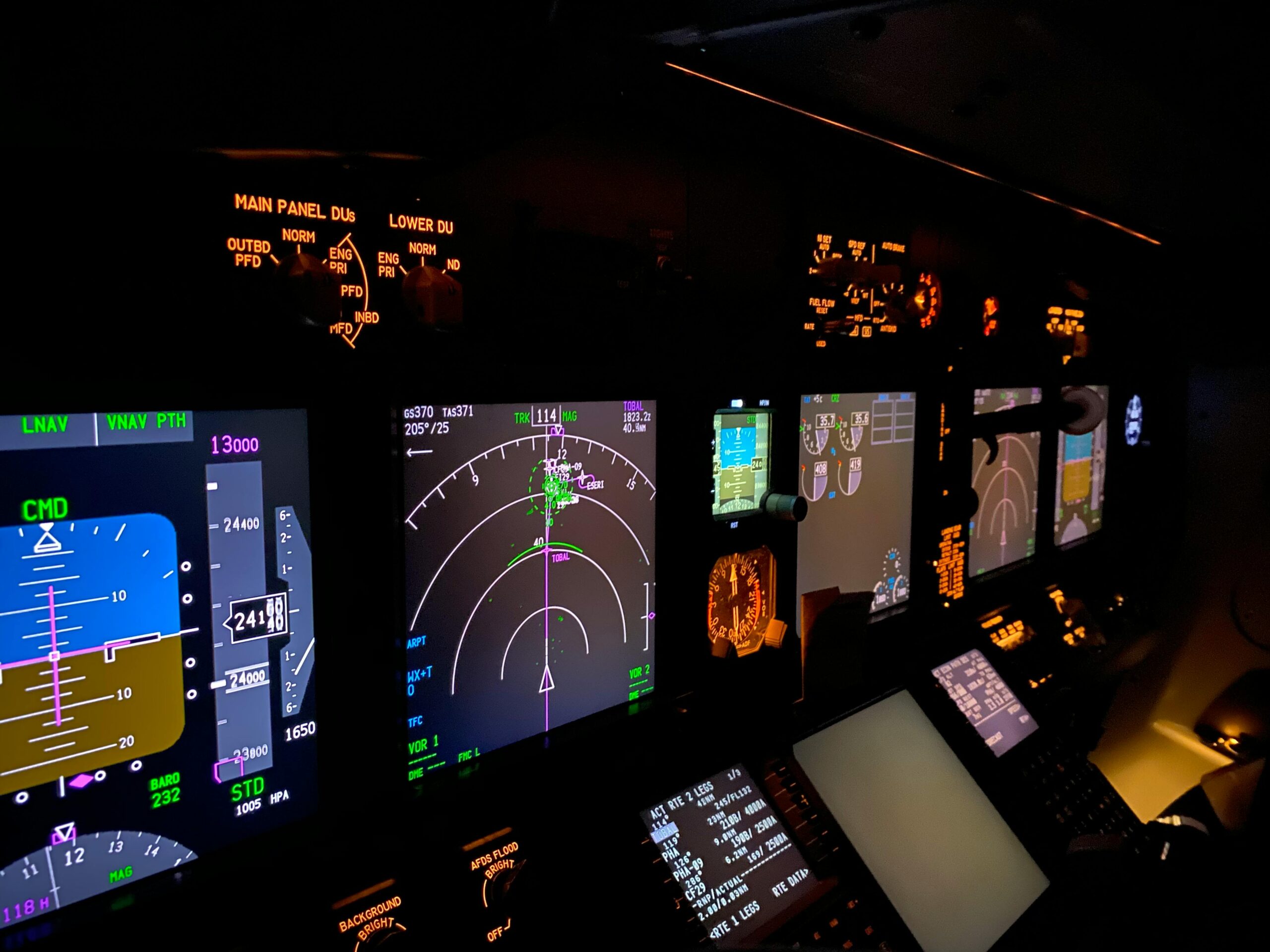
UX in Aviation: Designing for Safety at 30,000 Feet
The aviation industry has long been a leader in HF-driven design. Consider the airplane cockpit: a space where pilots manage hundreds of controls, indicators, and decisions under time pressure. Every button, dial, and alert is placed with purpose—designed to:
- Prevent confusion (e.g., standardized instrument layouts)
- Prioritize crucial information (e.g., auditory vs. visual alerts)
- Allow quick reactions during emergencies
Real-World Case Study: Boeing 737 MAX Crashes and the MCAS Failure
In 2018 and 2019, two Boeing 737 MAX aircraft—Lion Air Flight 610 and Ethiopian Airlines Flight 302—crashed, killing 346 people. Investigations revealed that poor Human Factors design contributed significantly to both accidents.
The Maneuvering Characteristics Augmentation System (MCAS) was introduced to automatically push the aircraft’s nose down under certain conditions. However:
- The system relied on data from a single angle-of-attack sensor.
- Pilots were not informed about the MCAS in training or manuals.
- There were no clear cockpit warnings to differentiate MCAS activation from other flight issues.
HF Design Failures:
- Lack of system visibility: Pilots didn’t know MCAS was active.
- Poor feedback loops: Repetitive nose-down actions without explanation caused confusion.
- Training gaps: HF principles emphasize adequate mental models—these weren’t provided.
Sources:
- U.S. House Committee Report on the Boeing 737 MAX
- Pasztor, B. (2020). Pilot Confusion Was a Factor in Boeing 737 MAX Crashes. The Wall Street Journal.
- The Verge. (2020). The 737 Max was supposed to be Boeing’s big comeback. Then it crashed.
UX in Healthcare: Design That Affects Lives
Healthcare environments are information-dense and fast-paced. Poor UX here doesn’t just cause frustration—it can be fatal.
- Confusing medication interfaces can lead to dosage errors.
- Poor layout in electronic health records (EHRs) can bury life-saving information.
- ICU monitors may overwhelm with non-prioritized alerts, leading to alarm fatigue.
Case Study: Alarm Fatigue and Infusion Pump Usability
In intensive care units (ICUs), patients are surrounded by machines: infusion pumps, ventilators, monitors—all equipped with alarms. When too many alarms go off, staff may tune them out. This phenomenon is called alarm fatigue.
In 2010, a patient at Massachusetts General Hospital died after a critical alarm on a heart monitor went unnoticed for 20 minutes. The alarm was either silenced or missed in a sea of less-critical notifications.
A separate study published in the Journal of the American Medical Informatics Association found that poorly designed pump interfaces led to misprogramming doses—some displayed medication names only partially or buried warnings in multiple submenus.
HF Design Failures:
- No prioritization of alarms—everything beeped, so nothing stood out.
- Cognitive overload—especially in emergencies, simple, intuitive interfaces are crucial.
- Complex UI flows—nurses had to navigate multiple confusing steps under pressure.
Sources:
- Sendelbach, S. & Funk, M. (2013). Alarm fatigue: a patient safety concern. AACN Advanced Critical Care.
- FDA Infusion Pump Safety Initiative, fda.gov
- ECRI Institute: Top 10 Health Technology Hazards Reports (2019–2023)
UX in Engineering & Control Systems
From nuclear power plants to space missions, HF principles are foundational to system interface design. These environments demand:
- Clear feedback loops
- High information clarity
- Fail-safe interactions
Designing control rooms, for instance, means anticipating cognitive load, visual scanning patterns, and how humans will react in edge-case scenarios.
Notable Example: Three Mile Island Nuclear Accident
The partial meltdown at Three Mile Island in 1979 was not just a technical failure, but a UX and HF disaster. Operators misunderstood the status of the cooling system because of poorly designed indicators and an overwhelming control panel. The interface did not clearly communicate critical system states.
HF Design Failures:
- Poor layout and information hierarchy
- Inconsistent and overloaded alarm systems
- Interfaces that required deep mental models not supported by training
Sources:
- U.S. Nuclear Regulatory Commission: Three Mile Island Accident Report
- Vicente, K. (2004). The Human Factor: Revolutionizing the Way People Live with Technology
What Designers Can Learn from Human Factors
Whether you’re building a mobile app or a medical device dashboard, you can apply HF thinking to your UX work:
- Prioritize usability over aesthetics—pretty isn’t always usable.
- Design for edge cases and stress conditions, not just ideal use.
- Test with real users in real scenarios, not just prototypes on screens.
- Understand human limits—attention, memory, error-proneness.
Embrace cross-disciplinary thinking: blend psychology, data, engineering, and design.
Getting Started with Human-Focused UX
Want to dive deeper into this critical aspect of UX? Here are some must-reads and resources:
Books:
- Don Norman, The Design of Everyday Things
- Steven Casey, Set Phasers on Stun
- Kim Vicente, The Human Factor: Revolutionizing the Way People Live with Technology
Courses & Certifications:
- Coursera: Human-Centered Design from UC San Diego
- MIT OpenCourseWare: Human Factors in Engineering
- Nielsen Norman Group UX Certification (with HF tracks)
Professional Organizations:
- Chartered Institutes of Ergonomics and Human Factors (CIEHF) – ergonomics.org.uk
- Human Factors and Ergonomics Society (HFES) – hfes.org
- Association for Computing Machinery – SIGCHI (Computer-Human Interaction)
Conclusion: Designing for Humans, Not Just Screens
User Experience is about understanding how people think, feel, and act—and then designing systems that support them. Whether you’re guiding a user through a sign-up flow or helping a pilot land a plane, great UX is great Human Factors.
Let’s stop treating UX like a toolset and start treating it like the human-centered discipline it truly is. If you’re a beginner, start here: study how people behave, where they struggle, and how design can make the complex feel safe and usable.
UX is about people. Start designing like it.
Leave a Reply